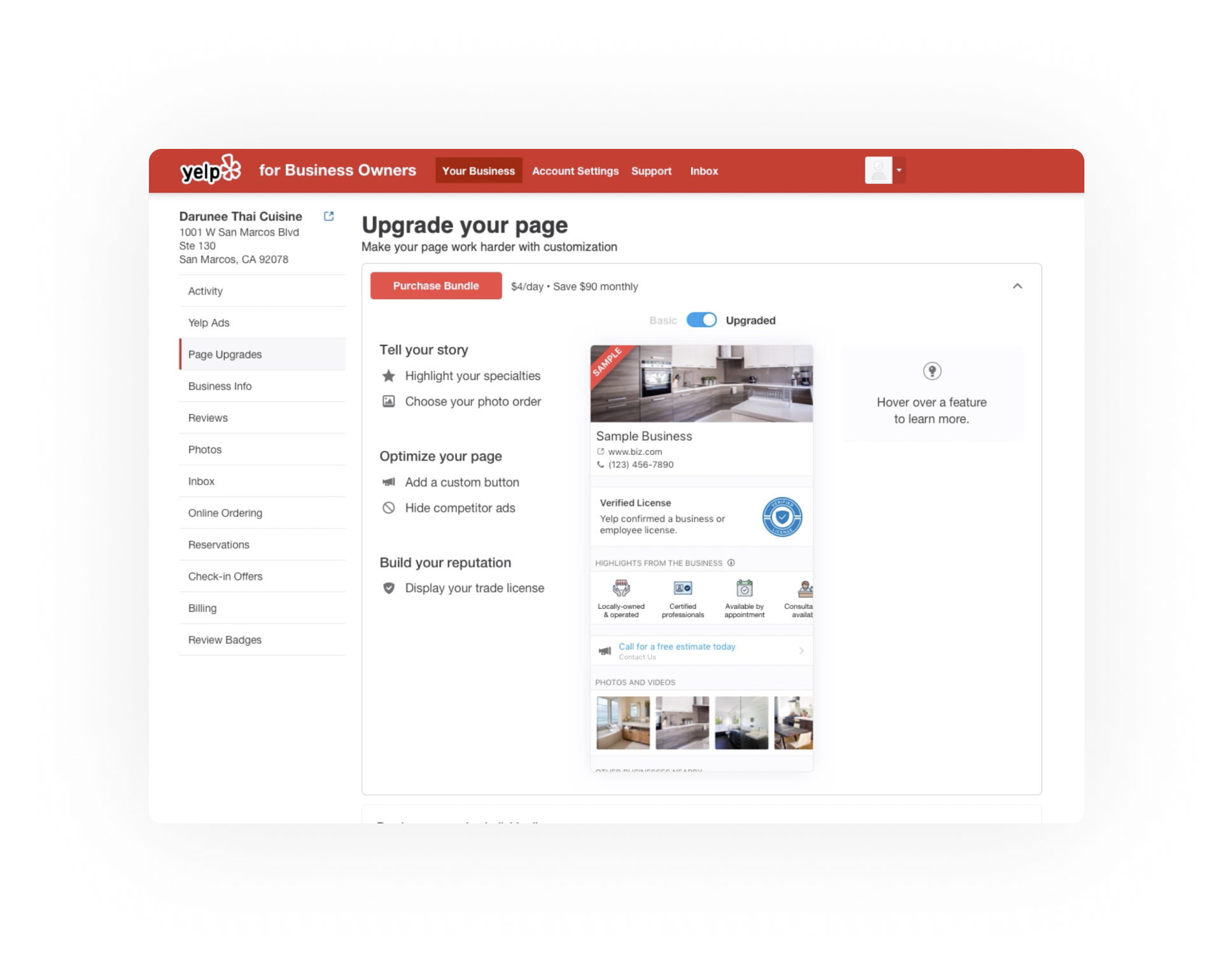
Yelp | Page Upgrades
Product Concept
People need to understand what profile products are, and find value in purchasing them.
While these products are often marketed, purchased, and used together, there was no central place from where business owners could purchase and manage the products.
The current design is a wall of text and doesn’t do a good job of explaining what business owners are buying and the value of every profile products. The redesign will focus on these objective to make this page clear and more engaging for business owners.
Objectives
Have centralize place where people can find all relevant profile products and understand the value of upgrade their page based on their needs.
Improving this page will allow marketing to drive traffic and improve adoption of profile products.
Metrics
Conversion Page land + interaction + checkout page land + purchase
Number of purchases This will be a useful to track against the old design, to ensure that our new UI is not negatively impacting purchase rates.
Number of products per purchase + % Business Owners buying all products The goal of our pricing/bundling presentation is to get business owners to purchase all of the products available to them.
Design Goals
Redesign the page to create a better UX and a scalable design solution.
Improve the conversion and nudge people to buy the bundle, allowing a-la-carte.
Be the destination of all products for purchase, set-up and products customization.
Design Concept and Explorations
With objectives and design goals in mind I went ahead and explore possible layout and design that could fulfilled our need in terms of design and business goals.
The design exploration were focused on making products more clear and understandable. At the same time we want to give full control to people, and make them choose the best product that would be suitable for their business.
After putting down some ideas I narrow them down in 3 main approaches. I build some prototypes in order to get a sense about how they would work and to gather peer and stakeholders feedback.
Accordion Prototype
This prototype is build on the idea to have the user focus on one part of the UI while interacting with the page.
The accordion style allow also differentiation between buying a bundle and buy profile products a-la-carte.
Checkboxes Prototype
This prototype is build on the idea of switching context to being able to change the experience.
A link indicate a chance to adjust the experience and switch between bundle and single profile products, which can be bought a-la-carte.
Research & User Testing
Type | Qualitative research
Methodology | Unmoderated remote user testing w/ prototype
After building the prototypes I teamed up with the user research team at Yelp to be able to have some support on conducting user testing. together with the team we came up with few objectives, and after conducting the interviews we were able to narrow down some key findings.
Objectives
Is the page confusing to people?
What people think the purpose of the page is?
What are profile products for people seeing this page?
Is clear what will be bought?
How people think a product is relevant?
Can people find the information they need?
Key findings
People want to visually see how their page will look like by buying a specific product
People want customize their page based on their needs
People want to understand the value of products before buying
Pain Points & Solutions
1 - Pain point
Missing value and benefit of current products selection (lack of trust)
1 - Solution
Explain each products and highlight how they will enhance your page (values)
2 - Pain point
Lack customization on the product selection (no control)
2 - Solution
Allow a-la-carte selection, but incentives people to bundle by adding discount (customization)
3 - Pain point
There is too much text on the page (missing visual empathy)
3 - Solution
Reduce text overload by visually explain features and benefit (user experience)
Design Iterations
Based on the results of the user research and interviews I was able to incorporate the feedback received during the user testing. Knowing pain points, and the solutions I tackle another round of design and came up with other designs solutions and possibilities.
In order to explain the final design we decided to deliver I also create and entire prototype to show the full experience and to gather last concise from the main stakeholders involved.
Final Design
After few iterations and gathering feedback from peers and stakeholders we landed on the final design that we decided to deliver and implement. The final designs also includes the full purchase and the a-la-carte purchase scenario.
Desktop Version
The desktop version incorporate all the feedback we got from the user interviews/research, plus some input form main stakeholders. awe polished the design showed in the design iteration and created custom assets for the page preview, and the information coming up on hover state.
Mobile Version
For the mobile version we adapted the layout for obvious space constraints and adjusted common UX pattern. We brought out the connote of the hover state and summarize it in a card that was tappable, we stacked the cards since scrolling is a relative low cognitive effort for people, and we moved the page preview at the bottom of the page. For the purchase state we only had to make a responsive layout/design since the purchased profile products were already design as a card in the desktop version.
Cards
Design
Cross-functional Cooperation
Project Manager
Continuous and fast feedback loop in order to iterate fast and implement changes.
Research Team
Help in conducting user interviews and summarize findings
Designers
UI/UX explorations, design discussions, feedback, and internal testing.
Engineers Web/m-Web
Worked closely to build and fine tuning final product before shipping
Marketing/Sales Team
Developing message, tone, voice for product and marketing material.
Stakeholders
Feedback and general overview of the project development and timeline


